
When managing cryptocurrency portfolios, it is incredibly easy to lose the macroeconomic plot. Staring at 15-minute charts filled with RSI divergence and moving average crossovers often leads to overtrading and emotional fatigue.
To filter out the noise of daily volatility, institutional allocators and spot investors rely on macro valuation models. One of the oldest and most widely referenced visual models in the industry is the Bitcoin Rainbow Chart.
Despite its somewhat playful name and colorful interface, the mathematical premise behind the chart is grounded in behavioral finance and logarithmic regression. However, the tool is far from perfect. In this guide, the Tapbit Research Desk breaks down the mechanics of the Rainbow Chart, how to interpret its color bands, and the critical flaw that forced the industry to recalculate the entire model.
The Mechanics: Logarithmic Regression
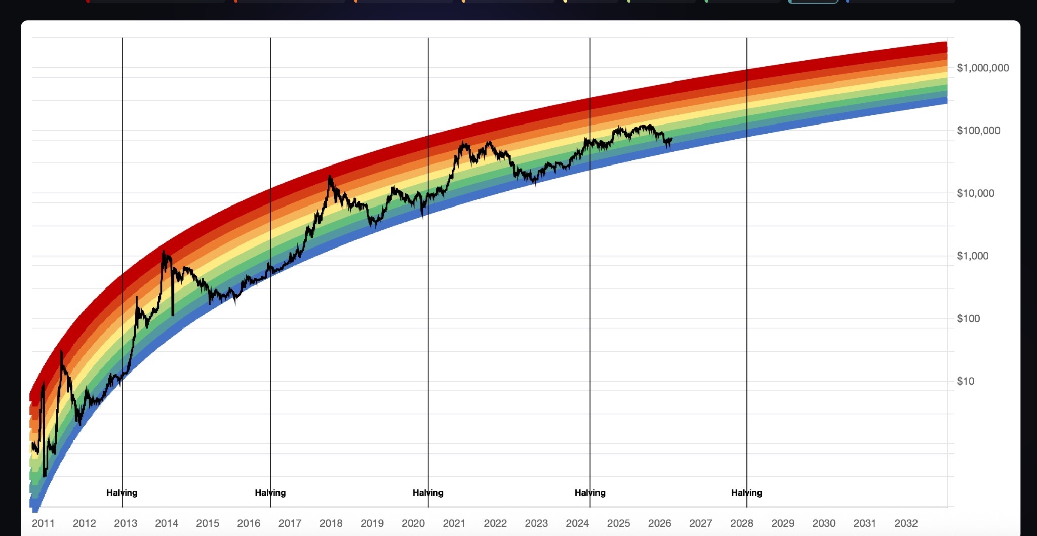
Introduced in 2014 by an early BitcoinTalk forum member, the Rainbow Chart was designed to track Bitcoin’s long-term valuation trajectory.
If you view Bitcoin's price history on a standard linear chart, the price action from 2010 to 2016 appears completely flat due to the massive exponential growth that occurred later. The Rainbow Chart fixes this by using a logarithmic scale, which measures the percentage of change rather than absolute dollar increments.
The chart then overlays color-coded bands based on a logarithmic regression curve. The underlying assumption is that as Bitcoin’s market capitalization expands and the asset matures, its extreme exponential growth (and subsequent volatility) will gradually decelerate, causing the bands to widen over time.
Decoding the Spectrum: Market Psychology
The Rainbow Chart is essentially a visual heat map of market psychology, categorizing price action into distinct sentiment zones:
-
The Blue Zones (Fire Sale / Accumulation): When the price drops into the dark blue or light blue bands, it signals severe market capitulation and extreme fear. Historically, these zones represent generational accumulation opportunities. For investors executing a Dollar-Cost Averaging (DCA) strategy, this is where conviction is tested and long-term positions are built.
-
The Green & Yellow Zones (Fair Value / Hold): These are the transition bands. When Bitcoin trades here, the market is generally in equilibrium. There is neither extreme euphoria nor mass panic. The standard playbook for this zone is holding existing spot positions and waiting for a clearer macro trend to dictate the next move.
-
The Orange & Red Zones (Extreme Greed / Maximum Bubble): When Bitcoin pierces the upper red bands, the market is structurally overheated. Driven by retail FOMO, excessive leverage, and media hype, the asset separates from its fundamental baseline. For disciplined traders, entering the red zone acts as a macro warning signal to begin scaling out of positions and taking profits.
The Reality Check: Why the Original Model Failed
Trusting any single model blindly in the cryptocurrency market is a fast track to capital destruction. To adhere to strict risk management, traders must understand the limitations of the tools they use.
The original Rainbow Chart was treated as gospel for years because its boundaries held perfectly. That changed in late 2022. During the depths of the bear market—fueled by the collapse of FTX and heavy macroeconomic tightening—Bitcoin’s price plummeted so aggressively that it broke completely through the bottom of the dark blue "Maximum Fear" band.
The model failed. It was invalidated because it was a backward-looking mathematical curve that could not price in unprecedented black swan events or structural shifts in global monetary policy. Consequently, quantitative analysts had to adjust the formula, resulting in the Bitcoin Rainbow Chart V2, which widened the lower bounds to accommodate this new historical data.
Strategic Application in 2026
The Rainbow Chart is a psychological anchor, not a timing signal. It is highly effective at preventing investors from panic-selling the absolute bottom and deterring them from buying the euphoric top.
However, professional traders do not use it in isolation. For a robust macro strategy, the Rainbow Chart should be cross-referenced with hard on-chain data, such as:
-
MVRV Z-Score: To measure the ratio between the current market cap and the realized cap.
-
Exchange Net Flows: To gauge whether whales are moving coins to cold storage (accumulation) or to exchanges (distribution).
By combining visual macro models with real-time on-chain data, you can navigate market cycles objectively. To build your portfolio and execute your macro strategy with institutional-grade liquidity, explore Tapbit today. Register for a new account or log in to access your advanced trading terminal.
Frequently Asked Questions (FAQ)
Can the Rainbow Chart predict the exact peak of the next bull market?
No. The chart relies entirely on historical price data and logarithmic regression. It provides a generalized estimate of where the market is historically overvalued, but it cannot predict absolute price ceilings, specific dates, or the impact of macroeconomic events like interest rate changes.
What is the difference between Rainbow Chart V1 and V2?
The original V1 model was broken during the 2022 crypto winter when Bitcoin's price dropped below the model's lowest predicted band. The V2 chart features a recalibrated logarithmic formula that widens the lower bands to better account for extreme, black-swan downside volatility.
Is the Rainbow Chart useful for day trading?
Absolutely not. The Rainbow Chart is a macro-level tool designed for assessing trends over months and years. It is completely useless for short-term day trading or scalping, which require precise technical analysis tools like volume profiles, order book depth, and momentum oscillators.