

In highly leveraged derivatives markets, severe price action is rarely an accident. Take early April 2026 – macroeconomic data and geopolitical tensions lined up, and crypto got hit with a cascade of liquidations. Daily open interest dropped by $300–500 million.
Retail traders view these volatile spikes as unpredictable "black swan" events. Institutional desks view them as predictable transfers of liquidity.
To bridge this information gap, professional traders rely on a specific order-flow visualization tool: the Liquidation Heatmap. This is not a predictive crystal ball; it is a structural map of market vulnerability. Here is an unvarnished look at how liquidation heatmaps work, why price is drawn to them, and how you can use this data to optimize execution on the Tapbit platform.
The Architecture of a Liquidation Heatmap
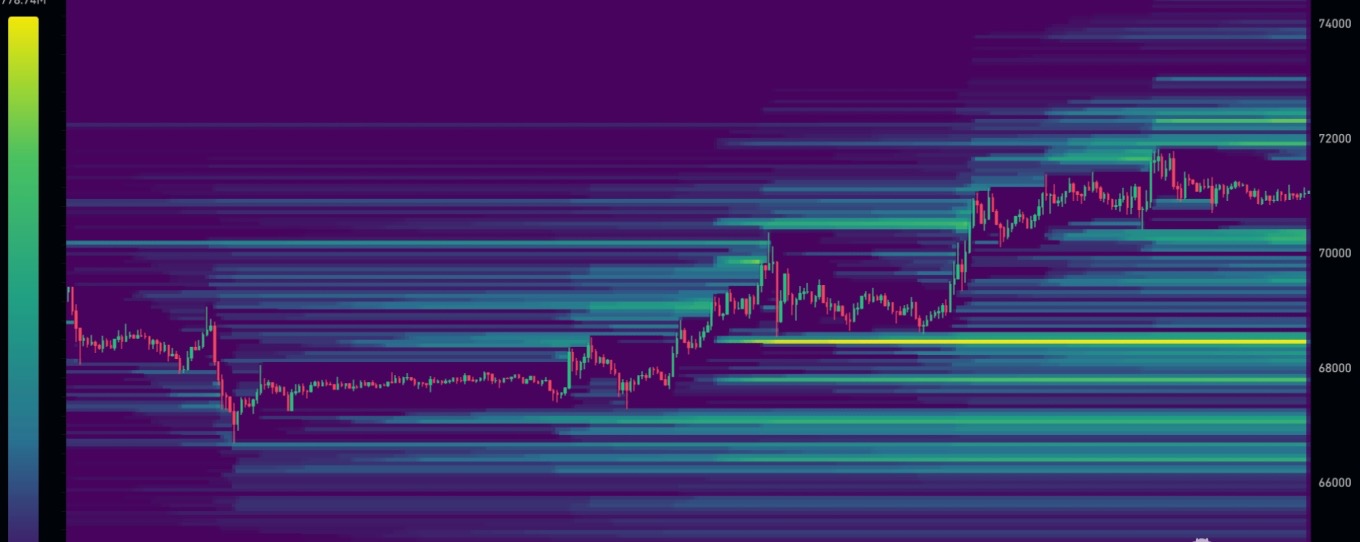
Traditional candlestick charts show you where the price has been. A liquidation heatmap shows you where the hidden leverage is waiting to explode.
It works by aggregating real-time exchange data—specifically open interest (OI), leverage ratios, and maintenance margin requirements. The system calculates the exact price levels where highly leveraged positions will be forced into mandatory liquidation.
Visually, these tools adopt a high-contrast, institutional terminal aesthetic:
-
Dark Zones (Purple/Black): Areas of sparse liquidity. Few leveraged positions are at risk here.
-
Bright Zones (Yellow/Red): The "Kill Zones." These are dense clusters of over-leveraged capital, representing massive pools of potential market orders waiting to be triggered.
The Mechanics of "Magnetic Zones"
The true value of a heatmap lies in understanding the magnetic effect of liquidity.
Large-volume traders (market makers and "whales") face a structural problem: size. If they dump or buy massive positions in a thin order book, they suffer severe slippage. To execute large orders efficiently, they need a counterparty. The easiest way to find massive, instant liquidity is to push the price into a bright zone on the heatmap, triggering forced liquidations.
The April 2026 Short Squeeze Consider the BTC price action from mid-April. As Bitcoin consolidated near $70,000, heatmaps illuminated a massive, bright yellow band of short liquidity resting just above $72,000. Institutional order flow targeted this exact level. Once the price pierced $72k, it triggered over $250 million in forced short liquidations.
Those liquidated shorts were forced to market-buy, acting as rocket fuel that propelled the price even higher. Understanding this mechanic reveals that heatmaps don't just show risk—they show the exact coordinates of dynamic support and resistance.
Tactical Execution: Applying Heatmaps on Tapbit
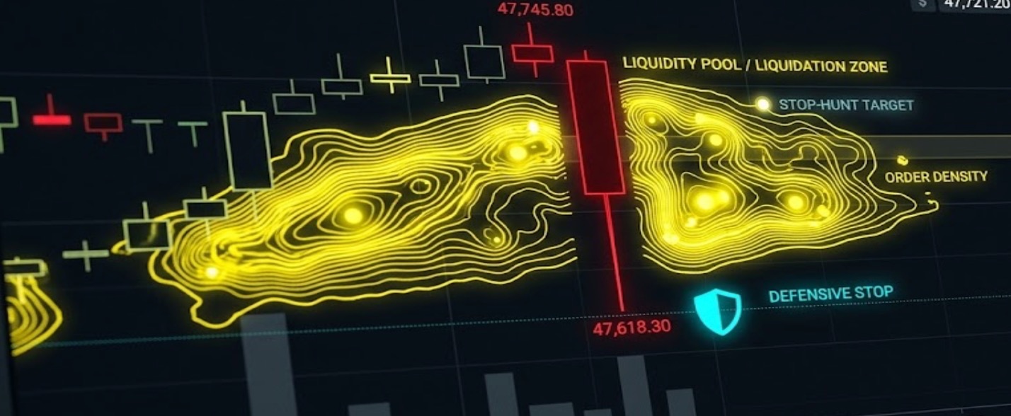
Knowing where the liquidity rests allows you to transition from reactive trading to proactive execution.
1. Defensive Stop-Loss Placement
Retail traders predictably place stop-losses at psychological round numbers or obvious swing highs/lows. Heatmaps clearly show these clustered targets. To avoid being swept up in a "stop run" (where price wicks down just to grab liquidity before reversing), place your stops outside or slightly beyond the brightest heatmap clusters.
2. Identifying Reversals vs. Breakouts
How the price interacts with a hot zone tells you everything about market momentum:
-
The Squeeze: If price accelerates into a liquidity cluster and sustains volume, you are witnessing a breakout fueled by forced liquidations.
-
The Liquidity Grab: If price pierces a bright zone, absorbs the liquidity, and immediately loses momentum (leaving a long wick on the chart), it is a classic reversal signal. The larger players have filled their orders, and the price will likely revert to the mean.
3. Executing Large Size with Zero Slippage
If you need to enter or exit a significant position on Tapbit, place your limit orders directly inside these liquidation clusters. When the market spikes into the zone, the flood of forced market orders will fill your limits instantly, effectively neutralizing your slippage.
The Institutional Reality Check
While highly effective, treating the heatmap as an infallible cheat code will drain your account. It must be paired with strict risk management, keeping the following frictions in mind:
-
API Latency: During violent, high-volume liquidations, aggregated heatmap data can lag by crucial seconds.
-
Spoofing Risk: Not all liquidity is real. Sophisticated algorithms sometimes place massive limit orders to create fake "heat" on the map, only to pull the orders milliseconds before execution to trap retail momentum traders.
-
Aggregated vs. Local: Heatmaps aggregate data globally. Exchange-specific order books may have slight variations.
The Bottom Line: The liquidation heatmap translates invisible market pressure into a visible coordinate system. It shows you exactly where the minefields are located. However, surviving the crossing requires discipline. In the Tapbit trading ecosystem, long-term profitability belongs to those who combine macroeconomic awareness with ruthless position sizing and leverage control. Log in to Tapbit today to execute your strategy with institutional-grade precision.
Frequently Asked Questions (FAQ)
What exactly does a liquidation heatmap show?
A liquidation heatmap provides a visual representation of estimated forced-liquidation levels across the derivatives market. By aggregating real-time open interest, leverage ratios, and maintenance margin requirements, it highlights specific price zones (often using bright colors like yellow or red) where a high volume of leveraged positions will be forcibly closed if the market reaches that price.
Why do prices frequently gravitate toward "magnetic zones" on the heatmap?
Large institutional participants require massive liquidity to execute high-volume orders without experiencing severe market slippage. Dense liquidation clusters provide this necessary counterparty liquidity. Consequently, price action is often driven toward these zones to trigger forced market orders, allowing large players to absorb the liquidity needed to fill their positions efficiently.
How can I use heatmaps to optimize my stop-loss placement?
Retail traders often place their stop-losses at predictable psychological levels (like round numbers or recent swing lows), creating dense liquidity clusters that become targets for "stop runs." By consulting a heatmap, you can identify these vulnerable clusters and strategically place your stop-loss orders slightly outside or beyond the "heat," significantly reducing your risk of being prematurely liquidated during a temporary price wick.


